Choosing the Right Colour Scheme
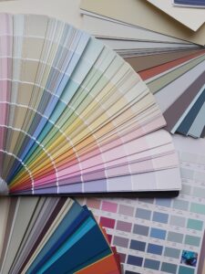
Choosing the right colour scheme can be a very difficult decision. There’s just so much choice out there with regards to paint colours and finishes. To help make things a little clearer I have compiled these tips for you.
1.What is your favourite colour?
Sounds like an obvious starting point but you would be amazed at how many people use “on-trend” colours rather than ones they really like. Start with a colour family i.e. blues or greens and then narrow it down. Do you prefer strong blues such as “Mussel” from Colourtrend or more pastel sky-blues like “Borrowed Light” from Farrow & Ball?
2.Choose a secondary colour that works with the first colour. If you aren’t too sure then the best thing to do is to keep it simple and pair it with white. White will work with every colour. You can also add in some other pops of colour through accessories or artwork.
3.What type of lighting is used in the space?
Is there lots of natural light or mostly artificial lighting? Colour is affected by the type of lighting conditions it is viewed in. This is why it is super important to buy tester pots and view the colour at different times of the day to make sure you are happy before painting the entire room.
4.What feeling/atmosphere do you want to create?
Colours affect how we feel in a space. Different rooms have different energy, for example in a bedroom you want to feel relaxed and calm whereas a kid’s playroom should be a fun creative space. High energy colours such as those from the red, orange and yellow families should be avoided where you want to feel calm. Lower energy colours such as blues, greens and purples should be used to create relaxed spaces. There is a big difference in moods that will be created within colour families too. Pastel tints are better for bright and airy spaces and darker shades for a cosy atmosphere.
5.When is the space used mostly?
For most people the living-room is used mostly in the evenings. If you want to create a cosy inviting space then you need to pay more attention to how the colour will look under artificial light rather than daylight. Kitchens and bathrooms are used throughout the day so the colour needs to appeal to you under all types of lighting.
6.What style are you aiming for?
Some colours suit certain styles more than others. For example coastal style interiors use a lot of blues in varying tones combined with whites and off-whites. For a more decadent style use a mix of jewel tones like emerald greens, golds and sapphire blues.
As you can see there are a lot of factors to take into account when it comes to choosing the right colour scheme. I hope using this checklist will help make decisions a little easier!
If you still need some guidance why not book in for a colour consultation with me? Find out more by clicking here.